Need the ability to play more


#1

Just read this article on The Current State of Adaptive Design and came across a concise summary of how I feel about Subform.

"What Subform needs to work on:
* Not immediately intuitive to newcomers
* Not necessarily a tool for play, designing in Subform works the best when you have clear intentions"

Not immediately intuitive: OK, yes, we already know this. I believe a designer with box model familiarity would be able to figure it out just fine.

Now for the important one...
Not for play: As I designer, I want and need to play in my design tool!


#2

I read that article too (thanks for writing it @charliedeets!), and I agree with the sentiment.
When I was first playing around with the ideas that later became Subform, I didn't intend on having any kind of direct manipulation functionality. @ryan was the one that insisted on the need, which is how we ended up with the "freeform" mode.

There's quite a bit more we can do on that front.
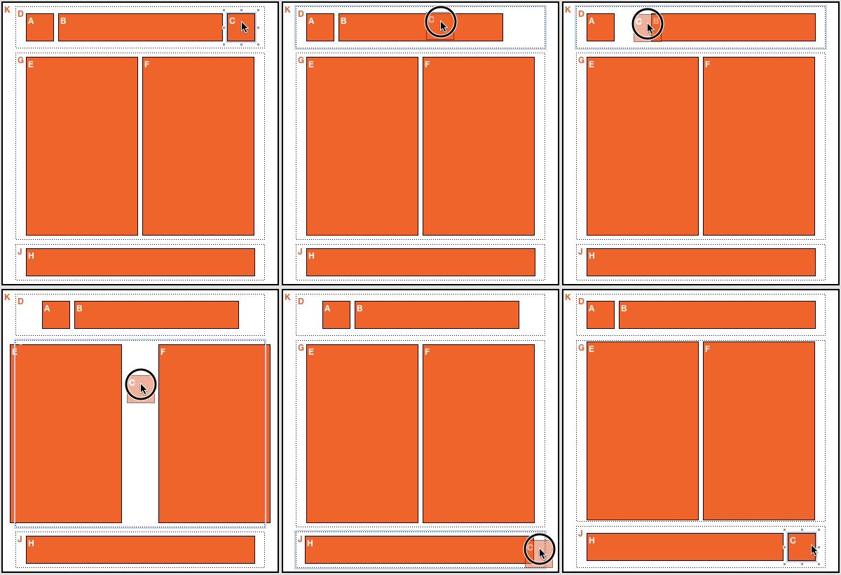
We could make Subform more playful by coming up with more direct manipulation schemes --- both directly manipulating elements and coming up with representations that allow direct manipulation of the layout relationships themselves

We could make things more playful by providing pre-built designs so that people can quickly "jump in" and try to modify an existing structure rather than coming up with one from scratch.
(Similarly to how children learn language by listening + mimicry --- they don't read a dictionary and then start synthesizing full complex sentences)

Right now, though, our focus is on getting the underlying semantics right for layout and component/reuse.
Without this strong foundation, Subform won't be worth playing with, because it might not be powerful enough to do the work that people need to do.

Part of Subform's value is that it forces designers to think differently about things --- to think of relationships and hierarchy and structure.
(We're not trying to pull a Sketch and do a "it's Photoshop, but easier!")

Thinking differently than you're used to is the opposite of intuitive, and it takes time and practice and play before those concepts become intuitive.
We cannot make them "intuitive" from the start, any more than a maths teacher can make zero or negative numbers or fractions "intuitive" on day 1.

So, given all that, what I'd love to discuss is how to make Subform more playful and intuitive.
Is it just having "click and drag to draw a rectangle"?
What can we do beyond that?
How can drawing those rectangles help people discover the more interesting capabilities of Subform?

If you're interested in these questions, I'd recommend reading Papert's Mindstorms.
Another interesting resource is this talk on thought as technology, which may have some pertinent ideas on how to represent the concepts within Subform (layout relationships, shared styles, etc).

So yeah, 100% agreed on the need to play. Put on your designer hat and propose something = )


#3

I'm excited to hear these thoughts! I think there are opportunities for 'play' in Subform that we have yet to experience as designers. When I use Framer or Origami, sometimes my mistakes turn into exciting new directions. I could imagine something like that might become more common as I use Subform more. I don't think focusing on direct manipulation will be as rewarding as what could potentially come of Subform's newer ways of thinking. I'll keep an eye our for any directions of play and report back. :slight_smile:


#4

Playfulness in a rule-based layout system could be achieved by making the reordering of the layout interesting.

Take a look at packetry: http://packery.metafizzy.co/

The interaction is direct and responsive. The boxes themselves could be resizeable within their ruleset, so when you make a box wider it could push others out of the way. This of course would affect their content, which in turn could also react and reorder according to their rules.

The next part of the puzzle would be a layout-independent overview of all used elements. There it would be easy to change element rules or set boundaries to rules. A designer can easily explore unexpected solutions, that would have been impossible to realize in a limited-time production environment.

This way, experimenting with different weights and solutions would actually be fun and not something to dread like it is today :wink:


#5

@kevin, I already mentioned that but I just say it again: you may check Antetype for inspiration. :slight_smile:

It’s good. They do the design tool with layout engine for years and have some really good ideas.
Here is their example of “playfulness”:

It is from their blog post from 2014: http://www.antetype.com/blog/2014/09/the-end-of-nudging/

I’m sure you can find many more good things in it. It is my main design tool and I really like working with it.


Removing the text/dataset system
2017.01.02 Status update
#6

We definitely looked at Antetype when we were thinking about Subform last year, and there are plenty of ideas worth stealing there. The direct manipulation of computed mode is certainly one of them, and I'd like to start exploring that stuff as soon as we figure out the new layout semantics.

Given that you are working regularly with Antetype, I'm curious to know what drew you to Subform.
That is, what do you hope that Subform will let you do that Antetype cannot?


#7

One thing I think would be good is the typical icons that can be clicked on for various things eg text, shapes, image etc. I understand the push for shortcuts instead. What's i would like to see is the option of showing the clickable tools or not. Then every time you click on the tool the shortcut flashes at the top like a lot of commands on mac in various apps (can't remember if they do it natively as well). The constant reminder could prompt the designer to use the shortcut. Instead of only seeing the shortcut on hover and in a small tooltip.


#8

Agree that a toolbar will help with discoverability (and when you forget hotkey mappings.) Tooltip hover to remember the hotkey is something I still do disarmingly often, especially when moving between different apps.

It's something we'll look at after the new layout foundation is in place—I don't want to design a toolbar until we have a good sense of what options need to be in it.


#9

I just put my eggs in two baskets :smile:

But the main things that are instantly better than Antetype are classes and data-sets.

When you have the whole interface designed with components you have a lot of similarity across the elements and it is a pain to update everything by hand. It is very limiting when you are trying to find a good solution to a problem.

Data-sets are also very important, because I often work on complex applications and it is a must to see if the UI works for all of the different cases. And I have to do this by hand.

You also sold it when you mentioned CADs :slight_smile: I like the parametrized components and hope you’ll manage to implement something similar some day.


#10

@combdn, check out this discussion of dataset use cases, it'd be great to get your input.
Especially re: your point about parameterized components --- there are a lot of ways to try and introduce such functionality (UI, some kind of scripting system, exposing some kind of API so you can manipulate Subform documents programmatically, etc) and it's not clear how we want to solve those needs.


Removing the text/dataset system
#11

I admit to being slightly amused. A lot of this was discussed in the interview we had with Kevin: http://thundernerdshoo.com/2016/10/45-modern-tools-for-digital-product-designers-with-designer-kevin-lynagh/

I'm glad that they are responding to feedback in a productive fashion. I firmly believe that there is room for a change in our design tools. They don't all need to look, feel, and respond like Photoshop, Sketch, Figma, etc. But some common tool patterns are important. Still very much looking forward to where Subform is headed, and I'm hoping that Kevin and Ryan might come back on the show, and discuss the post-Kickstarter experience, and how things are going.