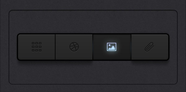
Shadows aside, there's a lot more going on here to give you the impression that the dark one is active. For one, the dark one is the only element that looks the way that it does out of 4 elements. It's the only element out of 4 with a darker background. It's also the only one out of 4 that's lit up. If the other 3 were like this one and this one was the one like the other 3, the context of it being the only one that's not like the others would still tell the user that it's the active one.
The same thing is happening here. The dark element is the only one that looks the way that it does, out of 3 different elements. And by the way, although this panel has a trendy flat design without shadow, the skeuomorphism is still very strong here. It lies in the fact that the two other elements have the same background as the entire panel, and so it's as if they are flat on the panel and the darker one is pressed in. Not to mention those very subtle light borders around the darker button adding to that effect.
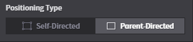
when there are only two buttons to toggle, I think there's going to be a degree of uncertainty to the user regardless of the styling. It can be minimized by using things like skeuomorphism, but at the same time, skeuomorphism only works because the user is seeing something that looks similar to things he has seen before, and so he has an idea as to how this unknown thing may function. The problem is that nowadays with the way so many of our computer interfaces are designed, I don't think there can be a guarantee that the user will see your button the way that you want him to see it. But if you keep your interface styling consistent, it'll reinforce itself onto the user. For example the user may look over to another panel in the interface that does have more than 2 buttons, and then they will see that the dark one is the one that is active. Or, they'll click and learn and press undo and now they know.
