Feature Suggestion: Closing Panels


#1

Hi,

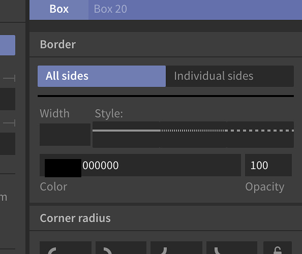
I recently spoke to Kevin about this in another thread, about the closing of panels and the loss of settings

Every other piece of software I've used, if you close a panel like that you do not expect it to clear your settings.

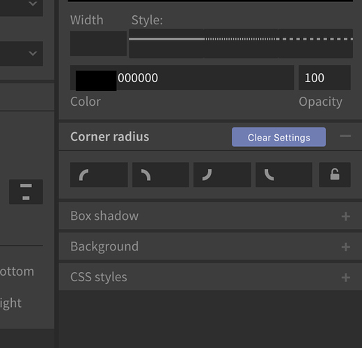
Let me show you a pic of what I think you could possibly aim for.

.

This would be much more intuitive I feel.

Have a (+) to open panels, and the (-) to close it (some folks just like to hide panels, but not actually delete settings), and then a button to clear the settings if required.

Thoughts?

PS: Or to solve all this just keep all the panels open (a la Sketch). Has done them no harm :wink:


Toggling a UI panel wipes settings
#2

Thanks for taking the time to writeup your idea.

It sounds like the primary benefit from this change is that the behavior is "much more intuitive".
Can you think of any other benefits?
What about tradeoffs?


#3

Nothing more than being "much more intuitive" I'm afraid

Just having the panels remain open (no + or -). K.I.S.S. all the way Kevin :slight_smile:

Thanks for all the feedback on a weekend buddy


#4

As a functional programmer / physicist, I'm all about making the complete state space explicit.

But as a mortal human with limited attention, though, sometimes I just want to see the settings that apply.

Like all product design, there are no right answers, just different tradeoffs.
For what it's worth, @Ryan and I did talk about this issue extensively during dev --- at some point we may writeup our thinking in a blog post.

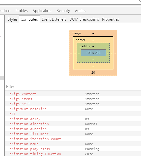
As a tl;dr of our reasoning, here's an example of what happens when another design tool (the Chrome Developer Tools) displays all possible properties.
This is on my 21 inch vertical monitor. Note that only about a third of the CSS properties are visible:

=)


#5

Fair play :slight_smile:

We could have property overload here.

Keep the panels as + and - to open and close panels, and not the x to remove chosen settings, and we're onto a winner Kevin :slight_smile:


#6

I would prefer being able to open/close panels as well; Not all information in the panels is important. However there is something to be said for indicating when there is important information in the panels. i.e. closed panels you have interacted with versus closed panels you haven't interacted with.

That could be interacted panels (with "non-default settings") could have a bold title, or a little * in front of them or something else entirely. This way you keep some of the explicitness of where explicit settings for this box are, but still have a "clean ui".


#7

Curious as to the reasoning behind wanting to "close" a panel while still keeping the settings.

  • Is it just a visual "cleanliness" issue? (You don't want to see properties you aren't concerned about right now.)
  • Is it that the current behavior is confusing? (You expected the "X" to close the panel, but it deleted all the properties.)
  • Something else?

#8

I think the wish to open/close panels stems from the current implementation where you have to click on a panel to enable the corresponding property. On my first use I also thought I was just "expanding" a collapsed panel, not actually enabling or disabling anything.

However I like the idea of adding and removing properties (as it is right now) rather than just showing everything even when some are not used.

I think streamlining the current interface could already be enough. For example:

  • Cluster disabled properties at the bottom, maybe with a line separating them from the enabled ones;
  • Replace the current red cross button with a trashcan icon to make it clear that it is a destructive action. You can't confuse that for a collapse button;

In general I don't think collapsing is even necessary as a feature. There's enough space and if the container can scroll then it'll adapt to most use cases.


#9

I actually had just filed a bug talking about this! Nice solve though – I think letting people control what they see is great.

Sketch has a super limited number of panels though, and Subform may not.


#10

I was also about to file a bug about this, and just found this thread immediately when looking to see if someone else had wrote about it.

To me the toggle close/open mechanism of interface panels is not something I expect to change any values or parameters. It's just a way for me to keep the parameters I'm interested in right now accessible. For example I might have set a border or shadow on an element and I know I'm not going to change that right now, so I'd hide it to make more room and keep my focus on the properties I want to work with now.

I think what throws me off here is the fact that the panel headers remain as if closed (and not removed). If you really want the behavior you have now (closing "background" panel means no background) I think this would be more clear if closing it removed the panel entirely instead of just minimizing it. That way the user would realize they just removed the settings and did not just hide the panels.

But, again, I think you should change it so it works more like other software where you just show/hide the parameters without changing them when you collapse/open a panel.


#11

It's a combination of a couple of things. Having the option to close panels, or like I may have mentioned before, just keeping the panels open, with a trash icon (some one mentioned this) to remove the properties.