
Stretch units
Some size or spacing values in Subform might look a little unfamiliar. Learn what these values mean---and how to use them to create responsive designs.
Basics
In digital design, sizes are typically specified in pixels, like a box that has a width of 100px. Using pixels is pretty straightforward when you know the exact size you want. Responsive designs, though, have elements that need to grow or shrink based on the size of the screen or browser window.
In Subform, you can specify sizes that respond to the size of their parent by using the stretch unit, s. While 100 is an absolute value, 1s is a relative one. Its exact size can vary, depending on its relationships with other elements.
Imagine you have two boxes, both set to a width of 1s. Instead of being fixed, the boxes now stretch in width to take up all the available space, even as the artboard resizes:
In this case, both boxes are dividing up the available space evenly. What if you wanted the first box to be three times as wide as the second one? Change its width to 3s:
The first box will now always be three times wider than the second box, but they both still stretch out to make sure all of the available space is used up.
Stretch values are based on some simple math. If you add up both of the stretch values in this example, you'd have 3s + 1s = 4s. This means that the available space is divided up into 4 total segments.
The first box's width is 3s, so that accounts for 3/4, or 75%, of the available space. The second box is 1s, so that's 1/4, or 25%, of the available space.
If you add another box to this example, the math changes slightly:
Add up all the stretch values now and you'll have 3s + 1s + 1s = 5s, or 5 total segments. The first box's width is 3s, so that's 3/5, or 60%. The other boxes are 1s, so that's 1/5, or 20% each.
What happens if you only have one box? In that case, it doesn't matter if the width is set to 1s or 22s, because it's the only element dividing up the space. 1/1 or 22/22 always equals 100%.
Stretch vs. percentage
It can seem easier to just use percentage values when you're creating responsive designs. For example, if you wanted one box to be three times as wide as the other, you could just set the widths to 75% and 25%:

That's pretty simple, but what happens if you decide to add some more boxes to the stack?
Since the first two boxes add up to all of the available space (75% + 25% = 100%), there isn't any more room to add in three more boxes. The new boxes overflow the container and aren't visible. You can still see their selection outlines when selected via the tree.
To fix this, you'll have to change the percentage values of your original two boxes to account for the three new ones. Rather than manually do this calculation every time you make a change, you can use stretch values instead. Here's what it looks like when you add three boxes to the original example, using stretch values:
3 + 1 + 1 + 1 + 1 = 7. The first box is 3/7 or 42.85%. The others are 1/7 or 14.28%. Add or remove boxes and Subform will automatically recalculate the widths for you. Much better than doing the math yourself, right?
Minimum & maximum sizes
Stretchable elements often need to have bounds: a minimum and/or maximum size that the element shouldn't be able exceed.
In Subform, you'll sometimes see default values like 1s_20. The first part, 1s, tells the element to stretch. The second part, _20, represents the minimum size. No matter how little space is available for the element, it will never shrink to less than 20:
Maximum sizes work the same way, but instead of using an underscore, they are indicated with a caret:, like 1s^400.
Minimum and maximum values can be specified together. A width of 1s_20^200 means that the element should stretch, but never be smaller than 20 or larger than 200.
Mixing stretch & other units
Elements that stretch can be used in conjunction with fixed size elements.
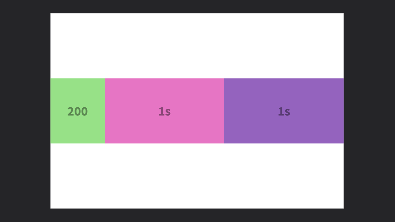
The leftmost box is set to a fixed width of 200. The right two boxes, both set to 1s, are dividing up the remaining available space: what's left after the 200 is accounted for.
Similarly, stretch elements can also work in conjunction with elements set to percentage sizes:
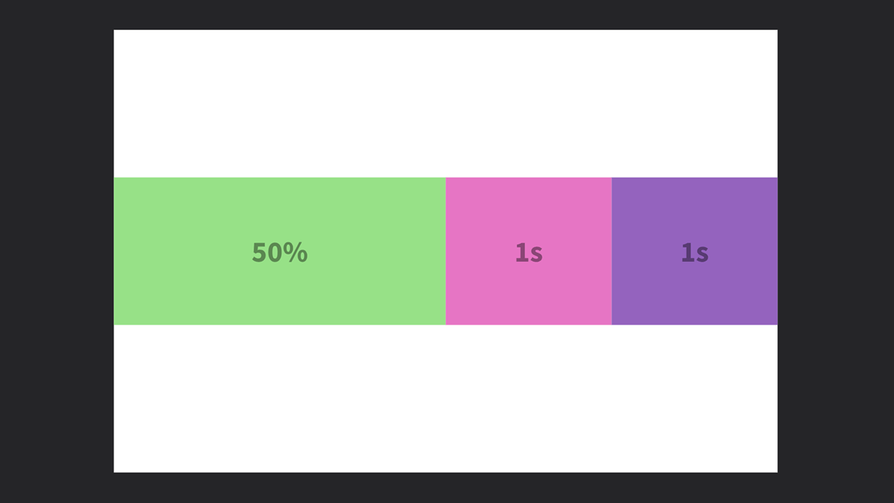
Here, the leftmost box is set to a percentage with of 50%, it will always take up 50% of its parent element. The right two boxes, both set to 1s, divide up the remaining 50%.
Note: Percentages are always based on the size of the parent element. If the parent is 100, a value of
100%will always equal 100,50%will always equal 50, and so on. Unlike stretch values, percentage values don't take into account the size or spacing of sibling elements.
