Awesome, thanks for making this Ethan! (And for doing it in Subform...  )
)
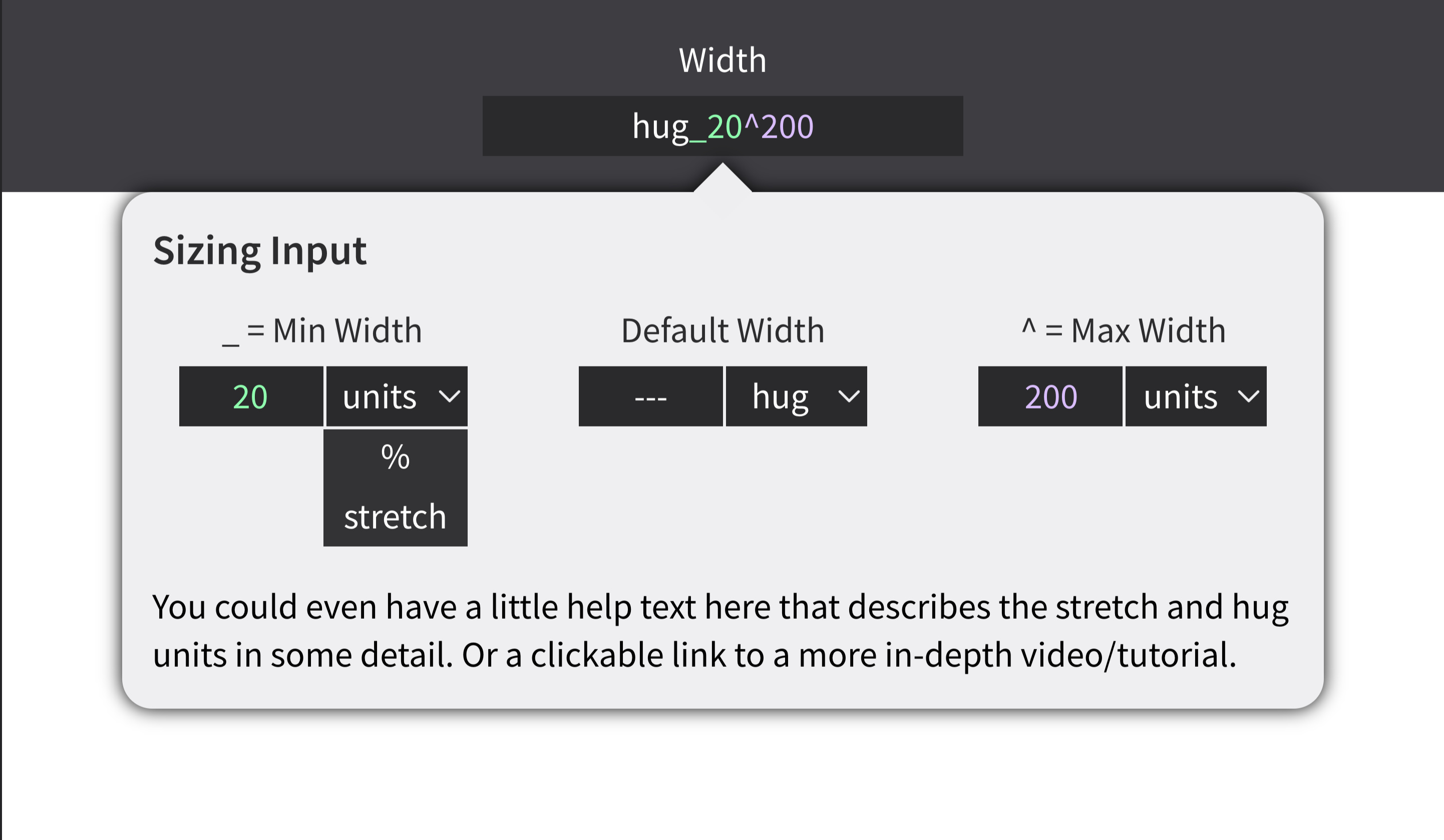
I really like the discoverability aspect and the idea of integrating some help information right there in context.
I think there are three issues that we face right now:
1. It's not clear what the available units are and how they work. Spacing and size can be set as the following units:
- Absolute (i.e. device independent pixels)
- Stretch (based on parent's size, number of siblings and their sizes)
- Percentage (based on parent's size)
Size is unique in that it can also be set as:
- Native (the absolute size of the corresponding image)
- Hug (the minimum size required to contain all children and their spacing)
On top of this, there is also the Aspect Ratio setting, which can cause one of both of the width/height size values to display as AR, because the layout engine is driving the size, based on an aspect ratio. (e.g. 16:9)
2. The syntax isn't discoverable. What are the underscore and caret characters for and how do they work? Changing around the default (1s_20) doesn't always produce a result that makes it evident.
3. It's not clear what combinations of units are possible. Not all units can be combined in the syntax. Subform doesn't accept relative values (stretch, percentage) as min/max values, for example.
In our testing, we've found that these are mostly learning issues. That is, once the designer has learned how these things work, they're no longer an obstacle to use.
That doesn't make them any less important to solve, but it does potentially change how we might address them. We want to make sure, for example, that any solution doesn't end up making things awkward/slower for designers who have learned the system.
I think your solution does a good job on #2: it provides labels and inputs that describe the various parts of the size/space value.
Seeing what units are available to use in a dropdown mostly solves #3. It doesn't really explain why those are the options, though. We might be able to do this in the help text or in a linked video as you mention.
I think #1 is probably the least addressed issue here, because even with some experimentation, it's still hard to understand the unit and layout semantics without some explanation/examples.
Some other thoughts:
When would this popover appear? On hover or focus? Is that annoying for users who have internalized this? Can it be shut off? If so, how?
What happens for inputs that can't accept min/max values?
Right now, hug and native are acting as values and units all-in-one. In reality, they are units, and the value just isn't displayed. I think it could be useful to see the value (like the native pixel size of an image). This could happen in the input or the HUD, or both. But it could be confusing when the input disables when selecting certain units.