Managing UI components – A pattern library feature request


#1

A case for a UI components library

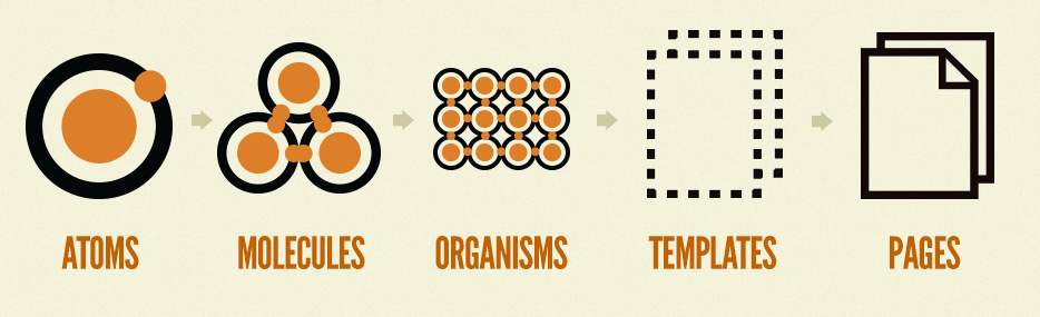
Atomic Design, Pattern Libraries, Design Systems, all the latest buzzwords in the product design world describe one important step in the process of successfully building and maintaining a digital product between teams of designers, developers and product managers.

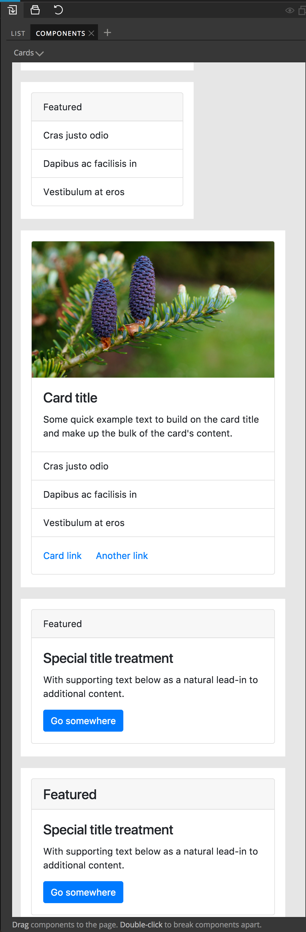
Even the lone wolf designer working on a project with more than one view/page is likely to lose track of which UI components they have created if those components are not displayed somewhere.

@Ryan and @kevin Are there any plans to offer some sort of visual catalogue of existing components and art (images, SVG logos/icons) for a design project in Subform?

Here are some of the advantages of having the ability to see all of the components and supporting art for a project, in my opinion:

  1. Although components may have been created in the design process, they may not be displayed on any artboard at a given time and the user may lose track of what components already exist and what they look like – This issue is magnified when working in a team
  2. Having a visual representation of a project's UI/components library facilitates design consistency between Subform files and is a necessity for a shared design system within a team
  3. It also helps in the hand-off process and the back and forth between developers and designers in the iteration process, especially if the dev approach is component based

I'm curious to hear what anyone else thinks about this feature or if there is a better way to approach it.


No release this week; What should we build next?
#2

I would love that.

With Sketch I create everything as nested symbols (with tons of override options) and then lay them all out in a separate page on individual artboards as a UI style guide. That page is as close to a "Source of Truth" as I've been able to implement with my teams.

As so many UI elements are standard/shared and simply need to be defined or styled according to a specific project's atoms/molecules (think form components or standard button states, typography), it makes sense to have a base that can simply be filled in. It also opens up some interesting possibilities of components with inherent behaviors and definitions.

If the pattern library can automatically generate a zeplin-like style guide (maybe even as an actual interactive site...) that would be even better.


#3

Just diving into using Subform. This is 100% the reason I wanted to test out subform — knowing that it is a component based tool. As our team is building out a design system, the reusable (and linked) styles/symbols in the Sketch Library are critical to the success. With Sketch library there is no need for the team to download and manage a new sketch file with each update, we can just push the changes to everyone from the source. Automatic consistency, when the symbols are used properly.


#4

Sounds like the Sketch library approach is working well—what’s missing from it for your team?


#5

Hi @Ryan, it’s been a while since I’ve posted this question to you and Kevin, could you share any ideas you may have on this topic?


#6

I agree in broad strokes—component libraries in a visual tool need to be visible, searchable, sharable. At the moment, there’s a lot of complexity in Subform’s component model to make components work with layout and to enable overrides. An example of challenge here is that there really isn’t a “platonic” version of a component that we can show—it renders based on where it’s placed.

None of this is insurmountable, but we’ve found in testing that the more complex component model is confusing for a lot of users. So we first have to make some decisions about what to prioritize: ease-of-use in a drawing/direct manipulation capacity or more truth to the production medium. There’s tradeoffs on both sides and development in this area has been a real time sink, so we want to make sure before we proceed that we’ve got a more useful and usable approach.


#7

Without adding the complexities of making a visual library searchable or sharable for now, couldn’t the saved components be a sort of artboard or page within Subform where the saved components go automatically (like in Sketch)? I guess this could also be done manually by the user. Ultimately, something like Invision’s Design system or Pattern Lab would be great for sharing within teams.

It would be great to see a visual “snapshot” of the UI component or class when searching for them here:

But having this “search” at the top of a panel that could look something like this:

This tab would fit well in the left panel area in Subform.


#8

@Benzo, Given that Subform’s components can have spacing and stretch/percentage sizes, do you have any ideas about how components should be sized in this view?
Should it drop any spacing values and just put every possible component/state together in a stack?
What about if the sizes are stretch or percentages, how should those resolve?


#9

@kevin, I think that there could be two approaches for this:

  1. A “static” approach where a sort of snapshot of the selected component is automatically taken by the system at the time of creating/saving the UI component generating a .png preview of the component to be used in the “Components” panel/window. When the user selects or drags the component’s preview from the panel onto the design canvas/area, the real component is placed for use.

This might be a good solution for the “static” approach. Maybe the snapshot could show the component in three screen size configurations (mobile, tablet and desktop) when you mouseover the preview in the side “Components” panel?

  1. A more “dynamic” approach would be to use the real UI component with all of its spacing/sizing properties active, sort of how Bootstrap has their responsive components laid out on a page. This approach would probably work best if the saved components were laid out in a large window or on a page, because some components may be too large to fit in a narrow side panel. In this approach, the components would simply fit and adjust based on the size of the Subform app window (like a web browser window).

Adding the ability to organize, categorize and tag these components in the library would be a powerful way to manage a growing library for a large project by including a search feature and descriptions to help teams easily use a shared library.