
The image I posted is from Mac OS
Please consider different color picker
kevin
#5
A richer color picker is on our "nice to have" list. The current one is the operating system color picker, and has several of the downsides you've mentioned, in addition to being different between Mac / Windows, etc.
Eventually we'd like to have a richer system, but it's a ways out because we need to think through a lot of related problems beyond just the picker: support for palettes, color variables, color spaces, the extent Subform should support varying colors programmatically (to make, e.g., heatmaps), tools to help designers think through problems of colorblindness and encoding quantitative values in color (e.g., http://colorbrewer2.org/), etc.
Could you explain a bit more about your use cases?
E.g., do you often need to convert between color spaces or use colors defined in RGB vs. CMYK vs. HSL?
Do you need the tool to recommend colors to you (like http://www.colourlovers.com/)?
When you say that Adobe's input is "more precise", what do you mean?
marjonsiero
#7
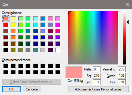
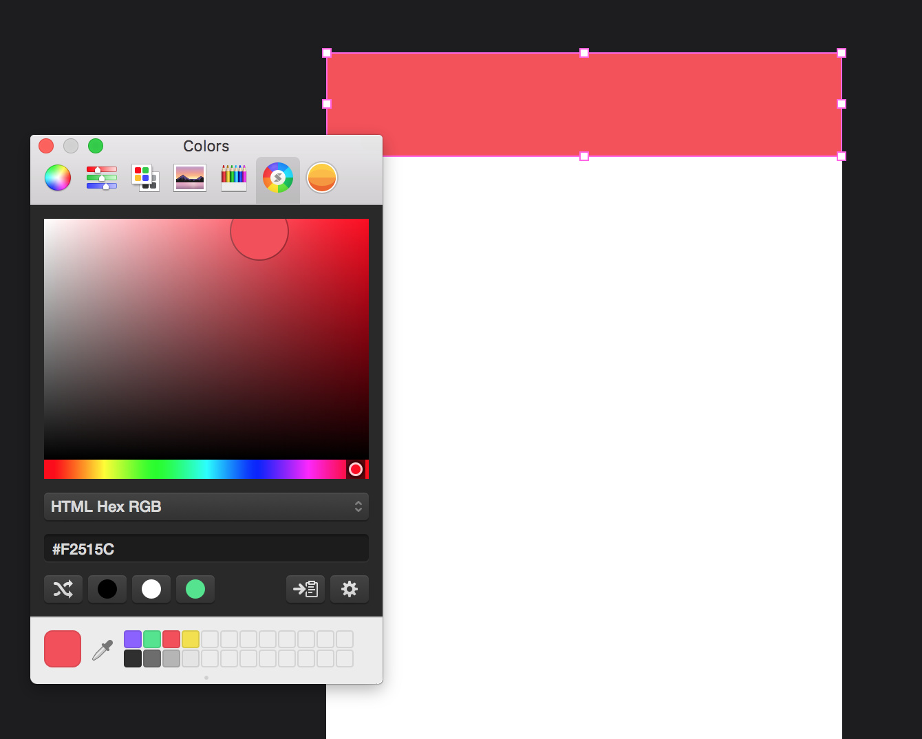
Hi Kevin, sorry for the late reply. My main problem with the current color picker is that it's quite difficult to find the exact color you are looking for. For example, I am working on a project for a brand that has an outdated yellow color as its brand color. We are looking for a warmer tone of yellow for our app designs but in Subform I feel I can't be as precise as I want to be. Going towards a warmer shade of yellow bit by bit is rather difficult.
Where as in the Adobe screenshot I attached in my original post, I have way more color options at hand and I can drag my selector bit by bit to find exactly that shade I am looking for. In the Adobe version I move towards white and towards black within the same window/field. In the Mac system color picker I can only go towards black in one place, and I have to go else where to go towards white more.
I hope this explains it a bit more.. 
kevin
#8
Hi @marjonsiero,
Your need definitely makes sense, thanks for sharing.
The Subform (AKA operating system default) color picker is very lacking in several respects on both Mac and Windows.
Before we get into designing our own Subform picker, though, we need to decide on how much power we actually need.
For example:
Should Subform enforce document-wide color spaces, or allow definition of colors in different spaces within the same document? What happens when you export or copy an image to a format that doesn't support a certain color space?
Do you want to manage colors within Subform using variables or named palettes? Or should we just make it easy to "copy" in colors in lots of different representations / spaces (HSL, RGB, CMYK, etc.)
Should Subform help you choose colors that will be faithfully reproduced by target devices? (In your example, the Adobe color picker has an option to restrict to "web safe colors")
Those are the kinds of questions that we want to figure out before getting into the design of a picker control itself.
That said --- I suspect the needs of UI designers are less about faithful reproduction and more about, as in your case, exploring different schemes for your designs.
TBD whether we accomplish that by building controls around different color space representations, baking in schemes that are grounded in perceptual research (e.g., something like Color Brewer), etc.
briannhinton
#9
Honestly, I'd be more interested in Subform being able to quickly pick colors, and easily manage them over playing with color patterns. Color management is an awkward experience in most applications. Being able to name colors, and reference them in a more seamless way (that exists outside of a "styles" group that always seems to include borders, etc. ie. Like Sketch.)
taurean
#10
I generally agree with this, but I think there still needs to be some level of quick tweaking and experimenting when selecting colors for the first time.
briannhinton
#11
I don't know if I agree. I tend to not use Sketch, Illustrator, Figma, etc. to pick, tweak and decide my colors. They aren't built for that. I use the web, SIP, Spectrum, Adobe Color, etc. Something built for that purpose. All I want in my "design" app is a good way to enter, manage, and access my colors.
daniel.keller
#12
I don't want to switch over to another program just for colors. for me it's kind of a lame excuse, if I switch to a program, I expect it to handle all the basic needs.. otherwise I might aswell just use sketch!
kevin
#13
@daniel.keller Can you elaborate on what you mean by "all the basic needs"? See my post from Feb 7 earlier in this topic re: color spaces, variables, etc.
The only way we can build a great solution is to understand the problems we are trying to solve --- that is the core of the design process. The best thing you can do to help (with this color picker or any other part of Subform) is to reflect on your workflow and your needs, and try to communicate them. Thanks.
daniel.keller
#14
@kevin yes!
- a toolbar, and maybe let me customize it like remove or add things
- a grid (obviously)
- being able to choose between different basic shapes and place them where you want
- a pen tool to draw vectors
- being able to drag elements
- drag & drop pictures into shapes to use them as masks
- a Zoom indicator with info in %
- a way to add type
- an easier more accessible way to create a component
- a way to access your components
- a way to add more artboards
- custom color picker, maybe low priority (plus a shortcut in the toolbar, like illustrator for example)
- also: if I hide an artboard, it's lost forever.. unless I cmd/ctrl+Z
subform is lacking familiarity so far, like to have shortcuts in the toolbar (so I don't have to look up the help section, I also suck at remembering shortcuts.)
that's all I can think of for now!
kevin
#15
@daniel.keller, sorry if I wasn't clear --- I just meant about the color picker = ) We've discussed a lot of the issues on the list in other topics.
The next release will be addressing a great deal of the issues you've listed.
Still in the design phase for what a better color picker might look like, though.
daniel.keller
#16
ok, I thought you meant in general
for the color picker I'd look at what functionality color palette creators have on the web and see what's useful for subform.
for example my favorite is https://coolors.co/453823-561f37-39a2ae-55dbcb-75e4b3
what's good about it (apart from color schemes, which you might not need)
- you can choose alternative shades
- lock colors (which is basically just saving a color in subform)
- drag them around to organize
- you would also need a bigger pool of colors to define and a way to filter for example, the deafault has not many and it's weird to drag&drop them in every time
- keeping it simple with 1 good color picker and 1 pool of colors, is way better then have like 6 options and 5 of them are useless.
I don't say you need a full fledged color scheme generator/creator, but some of them have good functionality which can be applied to software I believe.
would be 1 more reason to not open my browser or another program.
hope this helps a bit!
rrbarry11
#17
Not sure if you’ve guys have seen this post Flinto Color Picker Blog Post
But they added some useful shortcuts to grab colors and add them to their palettes. Might be awesome to implement something just as useful for Subform.
kevin
#18
Thanks for the link! Flinto’s picker’s emphasis on speed — the automatic recognition of values on your clipboard and eyedropper hotkey — look real nice. Not sure when colorpicker redesign will come up on our roadmap, but I’ll make a note about these aspects for when it does. Thanks!
JohaWeber
#19
Please please please add a different color picker. I will be honest: If I have to work with the windows-default color picker this software isn’t for me. This bastard just drives one insane!
IMO color is a pretty critical part in UI/UX-Design, therefore its handling should be very smooth and intuitive and perhaps even a bit playful - and after the defining of colors the repetitive task of choosing the right color while designing the UI should be should occur as seldom as possible. Take another look at the windows color picker - this thing is the direct opposite of my description. It’s just an interface box straight from hell…
Taking a look at the material-guidelines from google or best practices to choose right colors for a UI, having the possibility to at least easily get shades AND tints in 10% or 5% steps and define names for them is pretty mandatory. Also don’t forget that darken and brighten a color does not always work the same way (changing actual lightness values or just mixing with black/white).
Fullscreen-View (F11)
anon70701857
#20
I’ll add some perspective from someone that built a product for designers in the past: I know the temptation is to have a perfect plan for every feature but having a solution for small recurrent workflow pains is very valuable in keeping the early testers engaged and productive. The only way you get a constant stream of feedback is by doing two things:
- enable productivity for your early users so they don’t have to offboard and go back to their previous tools
- make your early testers feel heard (there’s no point in spending time on a product if the team doesn’t seem to be open to the feedback)
I made both mistakes in the past, and then I overcompensated by doing too much of it. Personally I feel the investment in a decent color picking experience was a good one at the early stage of the tool I was building and when we got it out we got an uptick in usage and more stickiness (users were using the product for more days in a row after downloading it according to our internal analytics).
It’s not a huge investment, even as a small patch to ease the pain while you figure out the real solution, it’s self contained and doesn’t undermine your longer term plans, and there’s plenty of options to just drop in something open source.
I would think about it 
anon82415626
#21
To add to the complexity, don’t do the ‘mistake’ Sketch has been doing. https://sketchtalk.io/discussion/2247/sketch-doesnt-do-color-management-and-why-thats-a-bad-idea
Not saying I fully understand (or want to) the color profile management. But after realising that the color picker in Sketch behaves differently on different screens (i have two external, different type screens with my MBP) depending on which color profile they have, really scared me…
Sketch are adding support for color management in their next release though - but I’m not sure how this will help me.
I don’t know if I need to understand this but in all design tools until now I have never had to think about it - so why should I now? And please do let me know why if you have the reasoning for it…
anon89472934
#22
I agree that a better color picker that is native to subform would be much appreciated!
The windows one brings back memories of MS Paint
For Mac users, I would recommend using Skala Color for now. It is an addon to the native Mac color picker and gives some minor improvements…
It works nicely with the saved color palette bar at the bottom and I think it is an improvement over switching between the color wheel and slider tabs.
Hope it helps!
Ryan
#23
Color management is definitely complex and confusing.
Sketch’s hand was forced to add color management (I believe it’s in the latest beta?) by the crop of new displays (new Macbook Pros, iMacs, iPhones among others) that support color spaces with wide gamuts like P3. They were previously relying on that fact that most displays use the sRGB color space, so they weren’t doing any conversion.
Even with the crop of new displays, sRGB remains the lingua franca of digital work. For the near future, most displays are still going to be sRGB. If you design against a wider gamut, you’re risking that the color you specified won’t render correctly for most users.
Working in sRGB means that colors will render similarly across different browsers and computers. Most browsers convert from sRGB to the display’s profile—and this is also what Subform does. So if your target is sRGB, you’re good.
One thing to note: if you’re working in Subform on a wide-gamut display, sampling colors off the screen with an eyedropper tool isn’t going to be a reliable. There’s a boring long technical reason for this, but the short of it is that the values reported by the picker can be slightly off from the actual specified/rendered value.
An exception would be if you are designing for only wide-gamut displays on a wide-gamut display—say, you’re designing an app that only runs on iPhone 7+/X on your iMac. In this case, you might want to take advantage of the extra color options and avoid the sRGB color space altogether. This isn’t something we support in Subform right now.
Longer term, as displays that support DCI-P3 and Rec.2020 become more prevalent, we’re unfortunately all going to have to move from not thinking about it to being on top of color spaces and conversion. Referencing color profiles is coming down the pipe in CSS at some point (check out this article from Apple and keep an eye on the CSS working group’s progress with the Color Module Level 4.)
We’ll see how things shake out. Hopefully, it’ll still be much less complex than color management for print work.