
In my opinion, there's no better way to learn/improve a tool than by using it for that exact purpose
That is what I intend to do throughout this early-release process.
In this post: Improving the user-interface for managing box model properties
Proposition: How might we improve the current user interface for managing box model properties such that we:
- Maintain all current functionality
- Minimize screen real estate where possible without sacrificing usability
- Maximize hit-target size for all form elements
- Minimize cognitive load through proper use of CRAP (consistency, repetition, alignment and proximity)
- Maximize design pattern reuse throughout application
Big reveal: before and after of 'Margin' property manager (mocked-up in Sketch)
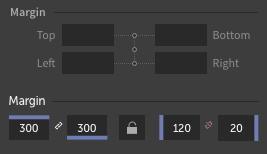
In defense of this new design
- All current functionality is maintained: 4 direct inputs and three toggle switches
- Screen real estate has nearly been cut in half
- Hit-target size of toggle switches has increased, and by separating them, the margin for error in selecting the wrong toggle has been greatly reduced
- Elements including the lock and link icons - and the functional use of Subform's blueish purple color - help connect this UI component with neighboring components, and removes the need for position labels (e.g. top, bottom, left, right) due to functional alignment of the lines to the input fields.
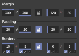
- This UI is designed in such a way that it could work unchanged for padding and border (at least border-width)...like so:
Mock-up re-created in Subform
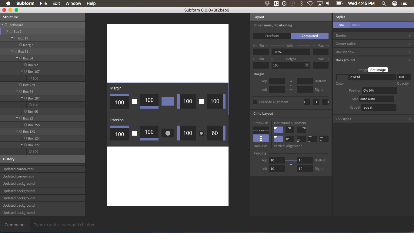
Subform document provided for exploration
Subform Box Model UI Design Concept
Plenty more to come
I plan to write about:
- The joys and frustrations I experienced while building this and other mock-ups in Subform
- Other ideas for how to successfully build upon the potentially ground-breaking capabilities currently presented in the early versions of Subform
Cheers,
rmion