Hey @ldubya,
Agree that the border control needs work. Building on the issues that you mentioned, here’s what I think are the problems:
-
The behavior when toggling between “all sides” and “individual sides” isn’t clear. What gets carried over, what gets removed?
-
Initial toggle from “all sides” to “individual sides” fills in each individual border value, which is tedious to unset.
-
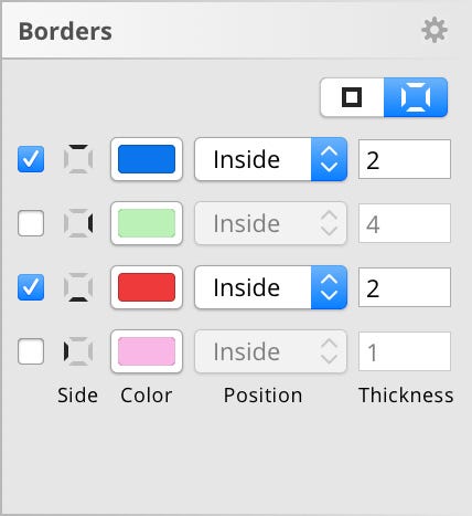
Each side has a row, which makes the control really tall, isn’t necessary, and is tough to parse at a glance.
Did I miss any? There’s nothing too technically difficult in this list, we just have to make some design decisions. I’ve punted on this, but I’m happy to work it out together and then implement.
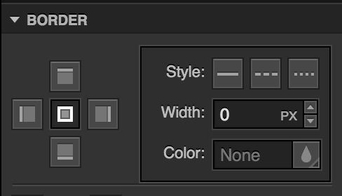
In terms of #3, I think there are some examples for how we could condense the control. Webflow’s control for this is decent:

Another option is something like this mockup from Davide Pisauri:

Neither of these allow you to style multiple sides at one time. (e.g. “Make the top and bottom 4px solid red”) Do you think that’s necessary, or is doing one at a time good enough?
In terms of #2, is preserving values (color, stroke width, stroke style) between the modes (all sides or individual sides) necessary? If no values are carried across, that makes things conceptually a little easier.
If values should be carried across, which side should we pick to define “all sides?” Right now we pick the top, but there’s really no reason that side is any more important than any other.
My suspicion is that carrying values between the modes probably isn’t a common use case. What do you think?


