Continuing the discussion from How to apply different size/padding/margin to elements at different artboard sizes:
The problem
As designers we change font sizes in small increments in a very controlled fashion based on screen size. However people are able to adjust the font size themselves due to their vision and personal preferences. Meaning designs can quickly become messy and break entirely.
A solution
Following inclusive design patterns I find myself reaching for the em and rem units regularly. This allows me to more easily manage typographic hierarchy, vertical rhythm and other layout elements for both screen size changes and user type size changes. If em and rem units can be integrated it would allow a higher level of responsive design than "media queries" typically provides. With a slider on the base font size we could also quickly see how the design can handle changes from both different screen sizes and user preferences.
Elements that change relative to base font size.
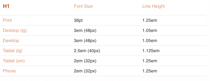
- Headings
- Padding
- Margin
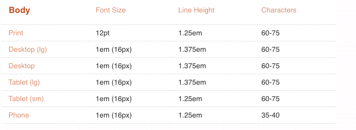
- Line-height (recommended 1.2 - 1.5 em) https://en.wikipedia.org/wiki/Leading
- Line width
(approx 45 - 85 characters - I count them and then set a width based on font relative units) https://www.smashingmagazine.com/2014/09/balancing-line-length-font-size-responsive-web-design/ - General sizing