
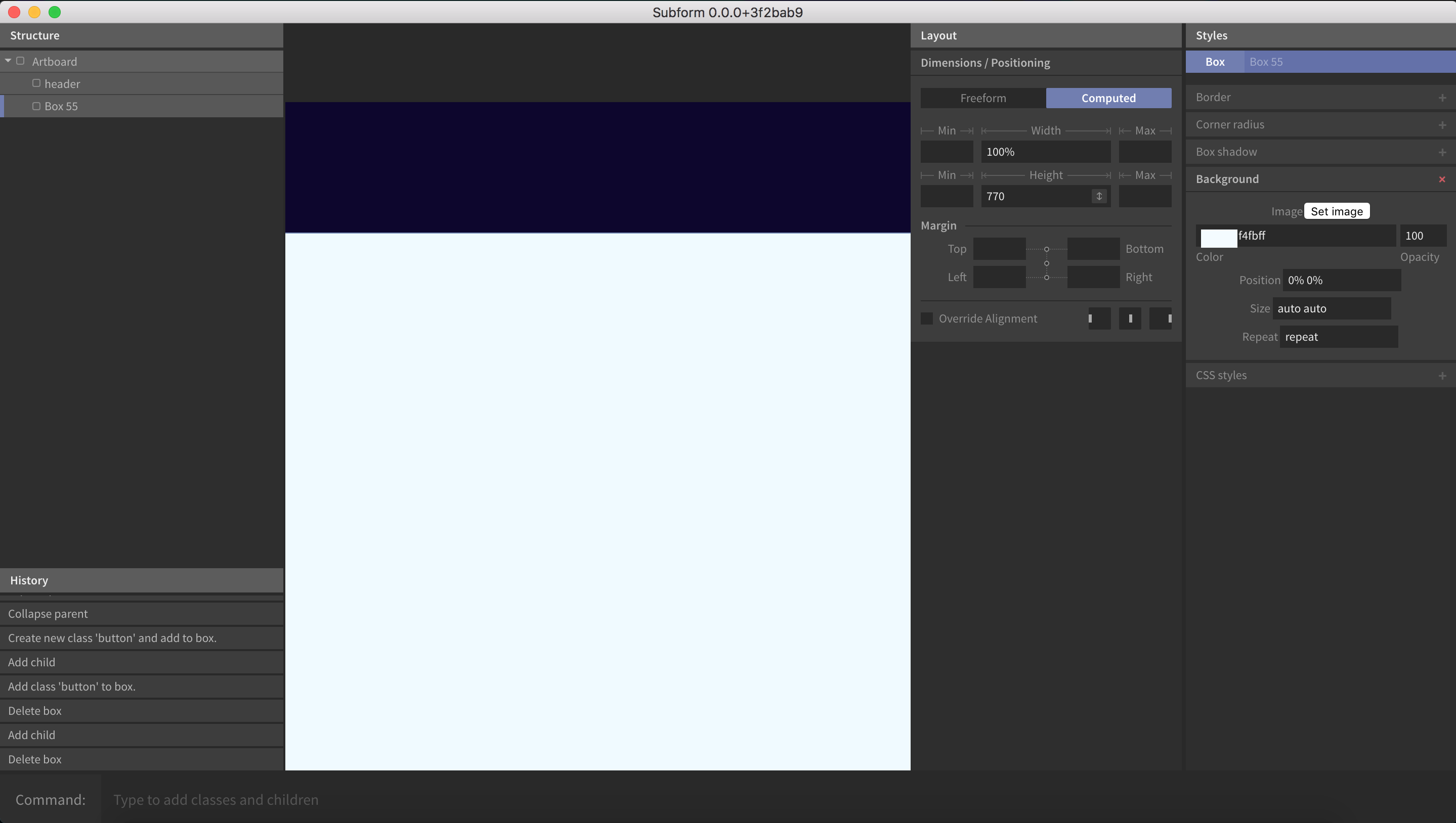
Right now the panels on the left and right take up too much space. Are we going to have the ability to resize the sidebars and increase the art-board area?
Increase the Art-board Area
grantharris
#2
I don't see why the two right panels can't be stacked with positioning at the top. Component Layout > Child Layout > Styles. Similar to Sketch groupings. Currently Subform is not at all usable on anything except my thunderbolt display.
it's challenging on a 13" macbook pro but i've been able to manage. i agree if the tools and controls could be positioned on the right all stacked together that would be fantastic. or at least allowing the user the ability to move items around in the UI to position elements how they want.
grantharris
#4
This is on 15". The real-estate being eaten up my empty menu bars is almost the same as artboard space I can see.
sherbondy
#6
I also think the interface should be different based on the screen's horizontal resolution.
Above, say, 1600dp (to borrow from android pixel parlance), the 2 column layout works nicely, but on smaller screens it could be a single right column toggled by a bar button between layout and styles.
Layout-only components like the artboard could automatically switch to showing the layout panel.
Could also offer a keyboard shortcut to quickly transition visibility between the two panels.
nickisnoble
#7
It seems to me that the app was initially designed with only mobile UI design in mind, which is really frustrating as a web designer. While this layout engine is amazing, it seems the leads made A LOT of assumptions.
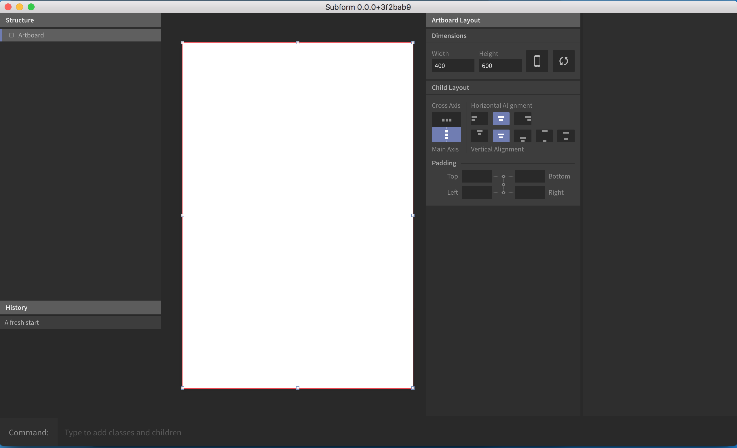
The largest preset artboard is 1024x1024... which to me makes very little sense for todays 'desktop' sizes, and there's no way currently to add or save our own.
Ryan
#9
The amount of screen real-estate eaten up by Subform's chrome is definitely not ideal right now. We feel your pain, @kevin works primarily on a 13" Macbook Air.
We didn't want to spend a bunch of time implementing a complex system of dockable, reusable, collapsable tabs a la Adobe, though, only to find out that most people didn't like that approach either.
In general, it sounds like just collapsing the right two columns into a single one would solve the problem for most of you? Is that right, or would you rather see a different approach?
WRT to the artboard presets, if you haven't yet, please check out this topic and weight in on how you'd like a custom preset system to work.
Single right sidebar for all panels
sixfive.creative
#10
for me i think that would work but also decrease the width of the right and left panels a bit to increase the art board area.
rrbarry11
#11
I also have this problem as I work on a 13" Macbook Pro and I work mostly with desktop sizes. One feature in sketch that I find super useful is the fullscreen option that sketch provides, would be great to have a similar feature for Subform for a future release.
The fullscreen mode is also helpful when I want to see the whole picture with no distractions and I also use it to quickly show my boss my work as I go instead of cluttering him with the programs ui.
conor
#12
Balsamiq Mockups has panels that only appear as components are selected, leaving plenty of real estate otherwise. The actual hide/show action is mildly irritating, but I've always thought it a good way to reduce clutter in the UI.