Does anyone else have a need for a 1-click all-zero default? (poll)


#1

When you add a box to a parent, the parent gets a new "Children Layout" panel.

The Children Layout panel lets you set a couple of default settings that the children will take on.

There are "quick alignment" options for making all children:

  • horizontal alignment:
    • align left, align right, align center,
  • vertical alignment:
    • align top, align middle, align bottom, evenly-spaced, align end-to-end with the center empty

But there is no one-click button for "make everything zero". Which is really what I want to do a lot of the time. Such as when I want zero padding and alignment, just to use the parent as a container for sub-components that fill up the space.

All of those fields that are "0" in the image above default to 1s (except the one on the bottom center) . I noticed that every time I add children to a box, I'm repetitively clicking on 4 different fields and filling them with "0". I feel as though I do it so often, that it should merit a "make everything zero" Quick alignment button to go along with the other "Quick alignment" buttons. (unless I have missed the button)

I do it at least as repetitively enough as to drive me to make this post, but I don't know if it's something other beta testers would like. So I'm wondering if the button would be beneficial to other testers? Do you think this is something needed?

  • I'd tap that
  • I would not have relations with that button

0voters


2017.08.14 Subform release 3520
#2

I agree that you identified a need, and a possible solution for that need. But I would encourage us all to ask 'why' a few more times to find out whether it's another button we need, or a new design pattern altogether.

The answer is usually not more buttons, rather less buttons and smarter applications.


#3

Great question. I've found myself wanting to "lock" all the space-around values for children layout to the same value.

It's tedious right now when you want to enter in a uniform set of space around all the children, whether that's 0 or something else. Like you said, you have to click or tab between 4 different fields and enter the value in each input.

Before we brainstorm specific implementations to work this into the UI, I'd like to make sure we're understanding all the possible requirements. So here's some follow-up questions:

  • Is locking all values together only what's needed, or should the cross-axis and main-axis spacing inputs also be able to be independently locked to each other? (e.g. 10 on the cross-before and cross-after, 100 on the main-before-first and main-after-last)

  • How does space-between fit into this? Should it always be independent, or should it also be "lockable" to the other values?

  • How would the quick alignment buttons work in conjunction with locking? Would it override the "lock" and just fill in the new values?

Edit: To be clear, I'm referring to a possible locking control here as an option, not a required or default behavior.


#4

Is this really a button or do we need the ability to define default layout behaviors more granularly? The following is partly an implementation suggestion, so apologies in advance, but it stems from a higher level observation that we're only defining half of the equation. We are given the option to determine how elements are laid out, but without closing the loop back to the parent element. That is to say: it seems to me that we need a "Fitting" behavior in addition to "Layout Type" in the Children Layout panel.

This allows us to have default settings based on the purpose the Children serve (maybe even define project-specific ones as presets in the future?) The three obvious ones are centered (horizontal/vertical), no-gutter (full width/height) and custom.

I'm not necessarily a fan of locking in this context, as I think it will restrict flexibility/playfulness too much. By following a similar toggling behavior to that of the Layout Type we build quick experimentation options into the UI without limiting granular fine-tuning or control.

Spacing is independent of Fitting just as we define Gutters in grids, you can play with them without changing the Fitting type. Modifying the main axis on a horizontal stack, however, or the cross axis on a vertical stack and you're off to Custom land.

To be honest, the children layout panel and the quick align options have been the source of some head-scratching on my part (why do quick align default to a 1s? Why do they override explicit values with that 1s? Why don't they remember the value I had before if I switch to another alignment? Is there a way to signal that some children have explicit overrides and won't be affected by the quick align? Can that override be cancelled? Why don't they display as "active"? Why do I have to enter additional units to define columns/rows in a grid layout instead of just choosing how many I want and modifying their size if it's not uniform? And more...)

If Fitting does make it in, maybe it should control quick align options. If I have a horizontal no-gutter Fitting I shouldn't be able to quick align left/right or space around. Maybe the UI for the quick align/axes needs to be something altogether different?


#5

@ldubya Can you tell us a bit more about what designs you are trying to make with this?
You say you want to

Here are some ways I can think of interpreting that, and current ways to express it in Subform:

  1. You know the parent size, and you want to stack up multiple children. Then you'd set the parent's children layout defaults as shown in your screenshot.

  2. You want one child to be the full size of its parent. I can think of a few ways to do this:

    • set that child to be "self directed" and give it before/after spacing of "0"
    • give that child width = height = 100% (could be self directed or parent directed, doesn't matter w/ the defaults)
    • set the parent children layout defaults as per your screenshot
    • set the parent to be a 1x1 grid with no margins, then all children will just be drawn on top of each other (and the parent).
  3. If you specifically care about the size of individual children --- and just want the parent to be big enough to hold all of them --- you can set the parent size to "hug" (I think this might be what @eyal.nudelman is asking for, but I'm not sure).

Anyway, before we discuss the particulars of possible new features, I'd like to make sure I understand what you are trying to do --- are you trying to use the parent to control the size of its children? To apply a shared style like a border or shadow to all the children? Etc.

If none of the layout options I explained make sense, then maybe a few screenshots or hand-drawn sketches might help.
Thanks!


#6

For me it's all about having multiple children without margin / padding.

So if I put in 2 child boxes, the entire space inside of the parent is filled by those two boxes, no padding / margin. I know I can use hug for when the parent should take on the dimensions of the children, but I need something easy for when I already have the height and width of the parent set to some value (either absolute or those *s relative sizes).

I like everything about being able to have all of those values set to "0" inside that panel, and being able to modify things as needed, except for the fact that it takes about 4 clicks / key presses / pastes to get to "all zero, no padding/margins" each time.

As a proposed solution, my line of thought was that, if you already have those other quick adjustment buttons set up, that this can just be another quick adjustment button. I was looking for it there and couldn't find it there, so maybe it would belong there? I'm not sure. But I do know that "zero margins/padding" is such a common thing in my design process, especially when dealing with wrapper containers with certain rules that aren't quite "hug", and their children, that it should take me a minimum amount of steps to accomplish.


#7

Kevin and I spent some time discussing this yesterday. I think it's a good suggestion and something we can add easily without a lot of downside.

Just to clarify/reiterate the use case here:

  • The designer wants a box's children to size up to their parent, rather than the parent to size down to the children (that would be a case for the hug value)
  • This is primarily useful for creating wrapper containers: "grouping" a bunch of children so they can all be positioned or sized together at once
  • It's two clicks (one for each axis) instead of 4 clicks / tabs / 0 entries

Does that sound right?

There is the possibility that pressing the "zero spacing" button could put your layout into an error state, if there isn't a stretch value in the main axis on any of the children. I'm willing to live with that outcome, given that the error state still displays all of the children save for the last one. (which shows as an error box)


#8

@kevin, sorry, was away and did not notice your response. @Ryan got the intent correctly in his most recent response: it's the sizing up, not hugging that I was aiming for with the idea of "Fitting".

To make sure I'm reading the implementation bullets above properly: spacing will remain independent from the sizing, correct?


#9

I think you've defined the issue quite well. It's about making a no-padding wrapper container in less than 4 clicks.

In my head, 1 click is the holy grail. 2 clicks is not quite 1 click, but it is half the amount of clicks, so it would be an improvement.

The question that arises now is what advantages 2 clicks has over one click in this scenario. I probably just would need to see the implementation and maybe 2 clicks wouldn't bother me. Maybe 4 was just too much. However, my line of thought is that if we may want both axes to be zero more often than we want only one axis to do so (which I believe would be the case since wrapper containers are very common), then would it be better to have a 1-click "wrapper" shortcut and then the second click, if needed, is what can toggle off an axis? Would toggling off an axis be any different from typing a non-zero number into one of the boxes in the currently existing Main Axis Defaults or Cross Axis Defaults to accomplish the axis adjustment once we've put the box into the all-zero wrapper configuration?

If the error state tells us why the error is there so that we can debug (or even better, how exactly we can fix it so we don't have to debug, just act), that would be excellent.


#10

This really applies to all of the "quick alignment" buttons. Right now, it's two clicks to align an element or its children in both axes, e.g. top left, bottom center, etc.

Our original thought was to make this what we called a "Denny's Menu." (just point to the picture of what you want!) It would be a matrix of every possible configuration with tiny icons illustrating each. One click to align both axes.

There ended up being a few problems with this approach:

  • The matrix takes up a lot of space in the UI. Hiding it in a dropdown menu or similar adds a click, so we're back to two clicks.

  • If you're only concerned with alignment in one axis, the Denny's menu is overkill, because you have to mentally parse out / ignore all the cross-axis configurations.

  • In practical usage, two clicks is pretty fast:

We'll start with adding a "zero" quick alignment button in each axis in the next release and see how that feels.

Yep, it already works that way:


#11

Yeah two clicks without having to type would probably suffice. I think the problem with the current method is that it's not just 4 clicks, but you also have to type/paste. So it's like 8 different actions really: focusIn type focusIn type focusIn type focusIn type.

click click beats that.


#12

I've got this up and working in the development version, it'll be in the August 14th release.


#13

I've been thinking more and more about this, and I have another approach to propose.
Be nice, it's not completely done, but it's a good place to start the conversation in my opinion... :slight_smile:


What am I solving for?

  1. Allowing users to quickly manage children layout to account for a common use case of a parent as nothing but a container for children elements.

  2. Maintaining a finer level of control without increasing UI complexity or taking up too much space in UI.

  3. Better visual cues to orient user on their selections.


What's not yet in here or is missing?

  1. Grid interface

  2. I've lost one quick alignment option, but I don't think it's crucial, explanation below.


Proposed UI Solution

Explanation
The Layout type is currently a dropdown, but stack/grid icons are used in the tree. Reinforcing them here and extracting them from the dropdown will enable quicker selections and standardize the visual vocabulary.

Introducing a Fitting selector (feel free to suggest alternative labels, that is just what stuck with me from my first post...) with two options: Full-Frame and Floating.
The interface changes based on selected fitting type.

When set to Full-Frame, the only thing that can be modified is the spacing. This is the all-zero default @ldubya originally called for.

When set to Floating a visual representation of the stack appears with the main/cross axis on their respective axis, default to 1s across, including spacing (unless changed from Full-Frame and then spacing value should be preserved). Two spacing quick alignment options appear along with spacing and when padding and spacing values match one of the quick alignment options, they should remain in 'active' state.

When padding/spacing values are modified, the stack representation visually updates to reflect them. Mousing over different parts of the visual representation allows for a one click alignment to each axis or absolute centering. On hover the stack will reposition according to cursor placement, and update values of the appropriate padding/spacing inputs; only takes affect on click, though.

Alternative: We could keep the visual representation even in Full-Frame mode and just default everything to zero, and on user modification of anything but spacing "revert" to floating and vice-versa.

As mentioned above, the one thing we're losing here is the ability to center along individual axis rather than both. Which can be done, at that point, with modifying just one input so not much of a loss compared to what I think are several improvements.

I have to say that I've struggled a bit with the current implementation. I ended up creating this mockup in Sketch, for example, because it was just much easier for this sort of playful experimentation. In too many times my efforts in Subform ended with an error state box because each time I changed layouts or needed to define something in one child, the container underflowed.

Let me know what you think...


#14

Thanks for mocking this up, Eyal!

This is actually pretty similar to our initial sketches for this control. I'll cover what I like about it and then talk about why we ultimately decided to go with a different approach.

Pros:

I think you're right that switching the layout type control from a dropdown to toggle buttons would be an improvement—it's one less click. This is already on my todo list to implement.

I like that this "cardinal direction" style of control for the spacing reenforces the spatial relationships, i.e. the space on the "left" side of the element is on the "left" side of the control. It's a little faster and easier to make the connection of what you want to edit.

Cons:

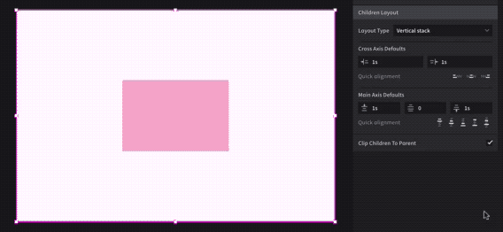
The most obvious difficulty with trying to preserve spatial relationships in this control is the "space-between" input. As you found, it doesn't fit nicely into the middle of the other inputs. Even if you removed the "layout preview" component and put it in the middle, it's not clear at a glance a) which axis it belongs to or b) what it's actually doing. (Putting space between every element, not just two elements.)

Space-before, space-between, and space-after on the main axis are also inextricably linked—they work together to both position and (if they are stretch) size the elements. Kevin and I felt that separating out space-between wasn't a good reflection of the layout model.

Keeping these inputs visually linked in a row also makes it easier to know which axis is the main axis. There are always three inputs instead of two on the cross-axis.

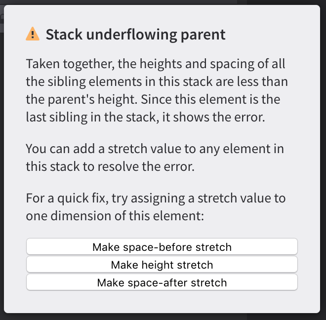
The "layout preview" or "visual representation of the stack" is an intriguing idea, as it helps the designer connect the values to the behavior. It's tricky, though, because it's an abstraction and doesn't always correspond to what's really happening on the artboard. It can't take into account the size of elements, the number of elements, or any overrides that the elements may have. In other words, the designer might end up more confused because what's showing in the preview box doesn't match up with what's actually going on in the layout.

The "quick alignment" buttons also have this problem to some extent, but I'm less bothered by it because the icons are less likely to be mistaken for a perfect representation of the layout.

I mentioned the Denny's menu idea a little earlier in this thread. That's another way to come as this visual representation idea, but it's not perfect either.

Consistent quick alignment buttons are tougher to accomplish with a cardinal direction layout, as you've mentioned.

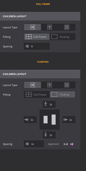
"Full-frame" and "floating" act here as modes, but that's not really consistent with the semantics of the layout engine. There's no difference between a children layout with 0 spacing all around and one with spacing on the left or right, etc. Your alternative take here I think is more spot on, but again, it's really solvable by an "align to left + right" and "align to top + bottom" quick buttons.

I definitely think there's room for improvement with the existing control. We spent a fair amount of time trying different configurations and each have their downsides. For now, though, our major consideration was that the control is reasonably functional and fast w/ the quick alignment buttons.