How do I draw elements?


#1

[UPDATE] press enter to draw a 1x1 pixel little square in the center of the screen. double click to do the same for text. I feel like I need a tutorial just do draw a rectangle that is 200x200 pixels and place it somewhere.

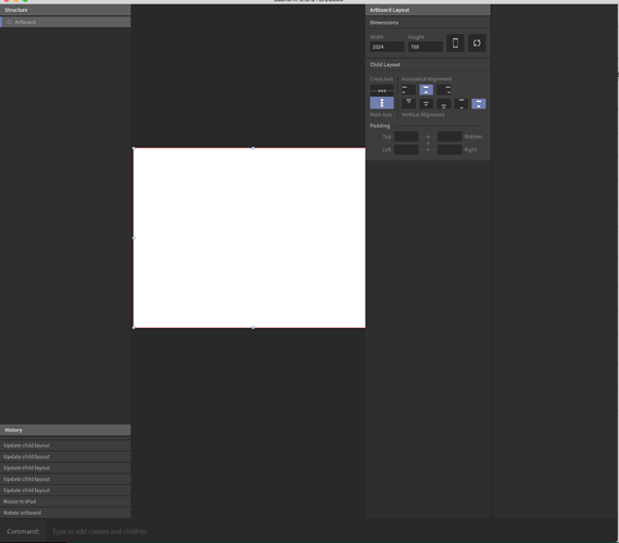
just installed - this may sound silly but I can't figure out how to draw anything. I have a history panel, a commands panel and the edit panel on the right. Nothing else. I feel like I'm missing something.


#2

Click on Help in the menu bar, then Show Help. You create boxes by hitting enter.


#3

I looked at the basics topic that said new elements are create by pressing Enter. It's a bit unusual, at least for me.
I'm definitely missing some of option to create basic elements like a rectangular, square, circle, line.


#4

Need to click help to learn how to draw elements? :frowning:


#5

i also couldn't figure out how to use the program when first opening it.


#6

Must admit. I was expecting at the very least, some basic tool icons along the top or someplace. Early days folks, but yeah that was something that made me go 'Oh'.


#7

@marc @jgnatek Same here. Subform seems to be really different in many ways. But I also have to admit that I like how this "lack of UI" keeps shouting "USE THE SHORTCUTS!" at me from the very beginning. To speak for myself: At the end of the day they are what I use to stay efficient. Not the UI.


#8

I couldn't disagree more. Making something approachable is key to adoption. If the tool isn't approachable to new users, then, at least for myself, I'll just stop using it


#9

had the exact same experience, it's not obvious and intuitive.. if you need an explanation how to use basic things in a program, it feels like it's badly designed.

you need at the very least:

  • vector tools like the pen tool and pathfinder
  • basic shapes
  • and other things I can't think of right now

#10

Hmmm.

Right.

Ok.

Kinda expected some basic drawing tools.

Lines, boxes, ovals.


#11

I like basic shortcuts too. But if in the next version you don't put them, at least auto open Help Window on fisrt run.


#12

So this topic "how to draw elements" has become the most viewed (next to official posts) and also has the most replies. This really speaks to the importance of good UX. This tool has really focused on bringing new features and capabilities and has almost completely neglected user experience. @ryan @kevin I think a key thing to remember is that this tool is not for simply "designers" it's for practitioners of UX. That being said - it's imperative that there is some consistency, recognition, visual salience, hierarchy, proper mapping, the list goes on. Being disruptive or innovative often requires a form a market readiness. As much as you'd like to completely change the way people design, fundamentally, I think it's important to not completely throw out their current workflows and enable them to transition within your tool, because it's the best way. One simple way (as an example) would be to have a free form drawing tool. that allows you to click and drag an element on the screen where you want it. the current workflow requires 5 interactions to accomplish this.
1. press enter
2. select the element you just created (this should be auto)
3. select free form
4. edit top left xy
5. edit bottom right XY

something that basic should be two interactions tops. ie.,

  1. press f(freeform)
  2. drag on canvas

I have a lot of hope for the tool - but it has a lot of UX work needed.


#13

Just a thought on this is if it auto selected after hitting enter then if you hit enter again as if you had intended to create 2 squares on the same level (like it does now) wouldn't it nest that within the first square instead? Maybe an option would be to have the auto select but if you hold down cmd while hitting enter it creates a second square on the same level as the first rather than nesting.


#14

I like that - I also prefer key interactions to be on the left side of the keyboard - I tend to have my right hand on a mouse or trackpad - I can work faster if I can create elements with buttons on the left.


#16

if you ask me.. apart from basic shapes and a pen tool, it also needs:

  • a Zoom indicator with info in %
  • a way to add type
  • a way to access your components
  • a way to add more artboards

I believe people rarely use shortcuts, at least I can't remember most, make it easier for the user!


#17

@daniel.keller

I use shortcuts all the time. The important thing I think that has been communicated already is that tool icons act as the "joy ride" for new users, and that over time people switch to shortcuts. As an example I rarely use icons to perform actions in Sketch, and I instead rely on shortcuts. I use Runner all the time to access symbols, insert objects, etc.

I agree with it being an issue that key elements are missing (beziers, lines, shapes, etc.). It's something I communicated during an interview with Ryan. I imagine over time we'll see more functionality emerge in Subform. I look forward to offering my experience, and exploring their approach to solving problems.


#18

This actually kind of blows my mind. I have no clue how to draw elements and I can't directly manipulate them…if this isn't a top priority I'm not sure what is.


#19

@contact.meszaros Please see the Subform 101 for answers to your questions.


#20

Just because people adopt something as they become "pro users" does not mean you should implement that as best practice. There is a required learning curve that you essentially force on the user. Imagine if you made shortcuts for everything in photoshop - it doesn't matter if you are a "pro user" it would take you 10 years to memorize everything or you'd have to look it up every time. Allow people the time they need to learn the shortcuts.


#21

yeah, let's print out a huge paper sheet with all the shortcuts on it, because that's what I'd have to do to use this program..